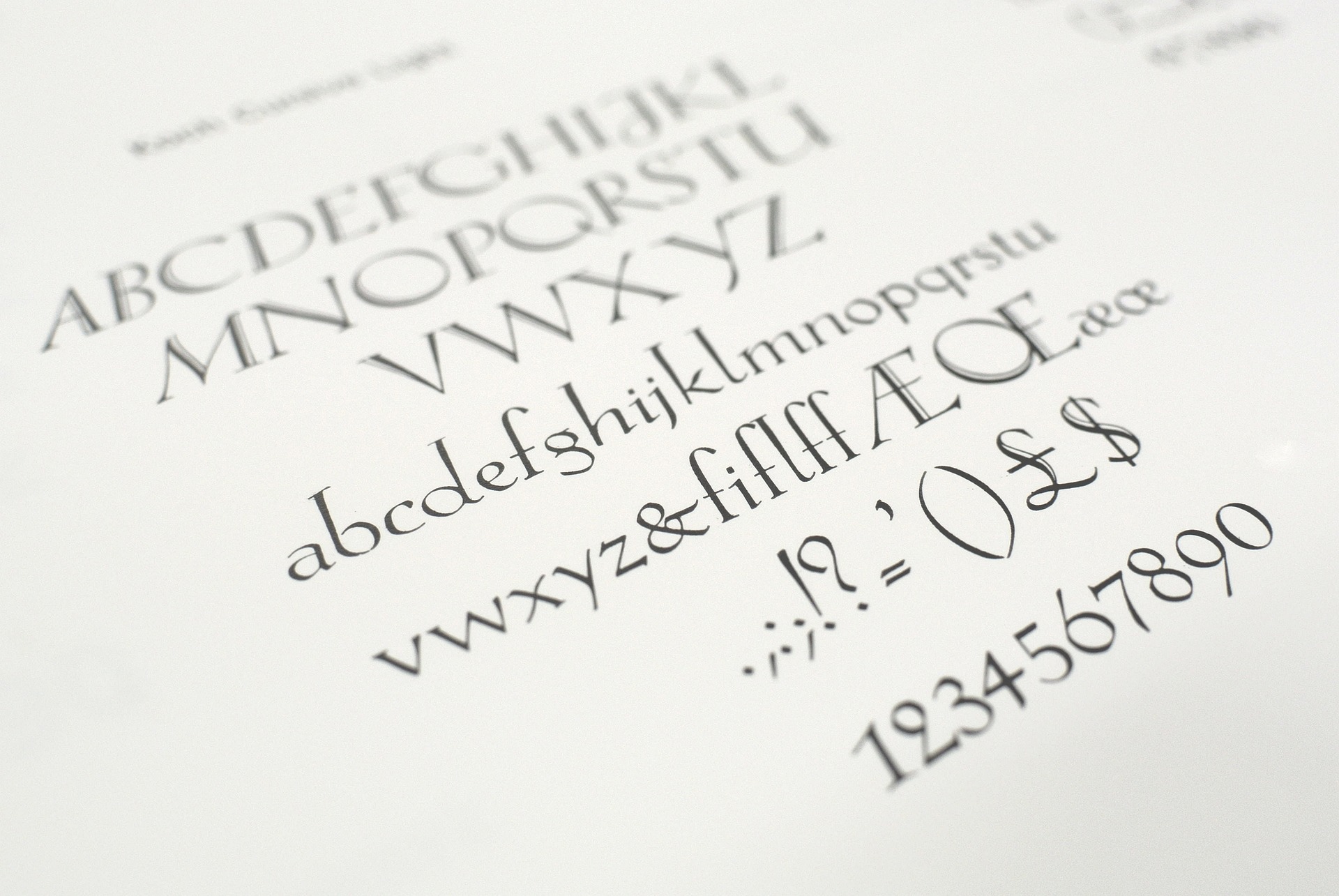
Have you ever heard anyone bring up fonts or type styles at a party? What about Thursday night drinks? In line at the grocery store?
No? Me either.
Typography might not be the most thrilling of topics in casual conversation, but when it comes to web design, rest assured it is anything but mundane.
Just like any other decision when it comes to designing a website, choosing the right combination of fonts, sizes, colors, or placement can be the difference between someone exploring more of your site or immediately clicking away.
Well-executed typography provides readability, separates and delineates text by establishing hierarchy, draws the eye to important parts of the page, and contributes to a positive user experience. It may seem obvious why these things are important, but let’s explore them anyway.
First Impressions Matter
The first element you see when a website loads should be something that makes the user want to stay, and that element is often text. A typeface doesn’t have to be overly large or ornate, but if there is one and only one thing above all others that is meant to be noticed, it has to stand out. It could be a font that is clean and professional or one that commands attention in a bright, bold color. Either way, it must be neat and readable. Messy fonts can discourage users from staying and exploring the rest of the site.
Brand Identity
Many companies have established branding that is easily recognized by their users. It’s a great way to show the company’s personality to both old and new users. This could show up in both the logo and the content across the site.
Accessibility
It’s safe to say that the content of a website is the most important piece of the puzzle. Without the content, all other elements would seem, well, pointless or random. Which is why it’s critically important that all users, including those with visual impairments, are considered when designing. The right combination of contrast, size, and screen-reader-friendly elements can make the experience easier and more enjoyable.
Consistency
Part of a good user experience includes a cohesive font style that spans the entire site. Having to adjust between different fonts on every page (or even just between sections) can be jarring and keep the user’s attention divided and wondering where they are supposed to be focusing.
Emotional Impact
Just like music or color, different fonts can evoke certain emotions or themes. For example, wider fonts tend to look more tech-forward while sans-serif fonts are more sleek and modern. Rounded letters can convey a friendly vibe. A well-chosen typeface can set the mood for a user’s experience.
Typography may not dominate casual conversation, but its impact on web design is undeniable. Thoughtful font choices can create engaging, user-friendly experiences that draw visitors in and keep them exploring. Remember, every font tells a story—make sure yours is saying the right thing.
Paragraph
- Amy
January 17, 2025
